
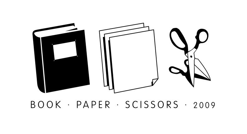
The announcement for the annual event Book, Paper, Scissors, held by the Philadelphia Center for the Book. They put a call out for design entries back in August. I submitted two. You can see them below.
I see alot of meaning in the winning design (above). I enjoy it because the graphic is clean and simple; it expresses the fundamentals of what this organization is all about: CMYK, printmaking, and ofcourse books and the paper and sharp objects that create them. The hands are symbolic because they reveal the reason why this organization exists: the enjoyment derived from their products appreciated only through the fingers, hands and eyes. Their art is meant to be touched, rubbed, flipped through, caressed, studied, inspected and handled.
The only thing I see lacking here is the typography. A sign that the creator of this flyer was not a Graphic Designer (this I actually know for a fact), but a printmaker.

When I created my original designs, I just went with the first ideas that popped into my head. After sharing them with a former teacher, I realized I should have researched the organization more before I started. My logo/illustration currently does not in any way convey the principals of the organization. Books like this would have been a great resource. I'm using this as a lesson and going back to "tweak" (or re-create, ha!) my original ideas. I hope to create several versions (a trip back to Vis. Comm 101). Stay tuned! Oh, and I hope you'll attend the event.

No comments:
Post a Comment