Tuesday, August 3, 2010

Target Payroll

The Target paycard proofs came from the printers today! I chose a layered design for this national program. Any target employee that opts in for the paycard will get paid on this crazy little piece of plastic. It's produced on clear plastic, ink and laminate on each side. The layered effect is very subtle.

Thursday, July 22, 2010

Let my bloggers go


Wil Reynolds, founder of SEO/SEM group Seer Interactive, hired me to create a document illustration for a recent blog post. Wil put together the 17 Commandments of Setting SEO Expectations. You can download the document here.

Tuesday, July 20, 2010

Makin Screens


Screen printing at Fleisher last nite. Exposed my first screen. Almost botched it by pulling it out of the black garbage bag in the middle of the class...but it worked! The print came out great.

Wednesday, July 14, 2010

Pipping Hot Print


The PEAC collateral is back from the printer and it looks great. The series includes a business card, letterhead and envelope design, printed with one color on uncoated matte paper. The card is the most interesting piece: PEAC is a non-profit organization with 15 board members, one employee, a boat-load of volunteers and a small budget. Logistics were messy. Not everyone has a PEAC e-mail address nor phone number, board members come and go, and only one person actually works at their official headquarters. They wanted small volumes of each card but they needed to print on an offset press to preserve the fine lines of the type and logo. Once we received price estimates from the printers, we knew we needed a better solution. A fellow designer recommended the space for people to fill in their information. I created a mock-up and the client loved it! Now anyone associated with the organization can help promote it. The cards help any volunteer feel a strong sense of pride and belonging.
Continuing Education

Started my class at the Fleisher Art Memorial this week. Small, personal classes within intimate settings. The teacher is great. I enjoy the new-ish Fleisher identity, created by Paragraph, a Philly branding agency.

Monday, June 28, 2010

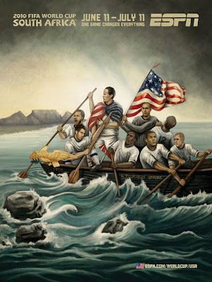
ESPN advertising campaign for the 2010 FIFA World Cup


ESPN's advertising campaign for the 2010 FIFA World Cup is a celebration of the World Cup and the host country, South Africa. The mural series includes 33 original pieces of artwork, one for each participating country and one general World Cup piece. Pictured above is the piece for the United States team. Each poster portrays the team's plight or essence as it enters the country for the World Cup. The posters mimic traditional hand-painted African signage and movie posters found in the streets and townships across South Africa. This campaign is beautiful and can be found all over Philadelphia, in sports bars, bus stops and transit. I've really enjoyed it.

To view all 33 posters, click here.

The paintings were created at AM I Collective Studios in Cape Town, South Africa.


Monday, June 7, 2010

Hot off the press


We received plastics today for two new programs: TacoBell Payroll and Comcast Payroll. Check em out! The designers at TacoBell decided to brand their card. I think this program will see a high enrollment due to the funky card. Heeeey spicey sauce packet. We convinced Comcast to use a pearl overlay, creating a shimmer effect, on both back and front. White cards turn out rather dull without it. We also chose a silver magstripe, ooooh lala!

Wednesday, June 2, 2010

In the News


I subscribe to NYT ad columnist Stuart Elliot's In Advertising, a free e-mail newsletter worth the read. It contains top industry stories and notable new campaigns. 160 made the news.....AGAIN!! Yeeeaaah Philly!

Friday, May 28, 2010

Must have!!

Data Flow 2 from Gestalten Books.

Wednesday, May 26, 2010

Presenting.......


The brand new Google Card, designed by Matt Schwartz, produced by Shawn Devlin (unfortunately, neither of these slackers have websites I can link to....shame!). This card will launch the new Google employee rewards program. Produced on clear plastic, with a double hit of the blue, green, red and yellow, topped off with a screen of white for the 'g.' The back has a silver magstripe. I'll try to take better shots of it soon. Nice job Matt & Shawn!!!

Sunday, May 23, 2010

Free Patterns!!

What girl or boy doesn't love hotdogs and chocolate chip treats!! Goofing off on a Sunday nite making delightful patterns. To use, scroll over the image, click down on the mouse and, while holding down, drag the image to your desktop. You can "tile" the image on your desktop, or use as a background on a web page. Shoot me an email for help!

Tuesday, May 18, 2010

Kris Chau


This postcard caught my eye at the Piazza flea market last Saturday. I love this illustration by Kris Chau. Check out her website. She has a quirky, romantic style and excellent handwriting!